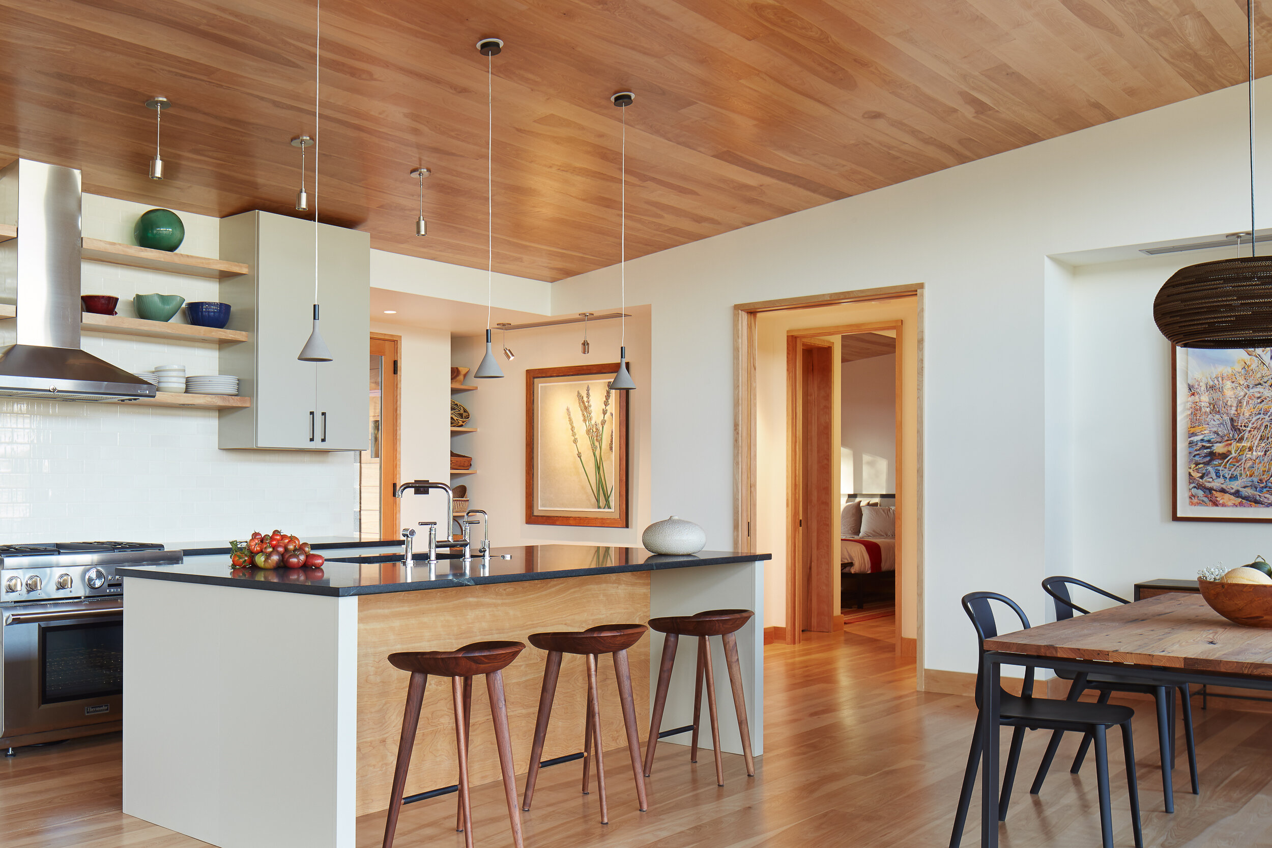
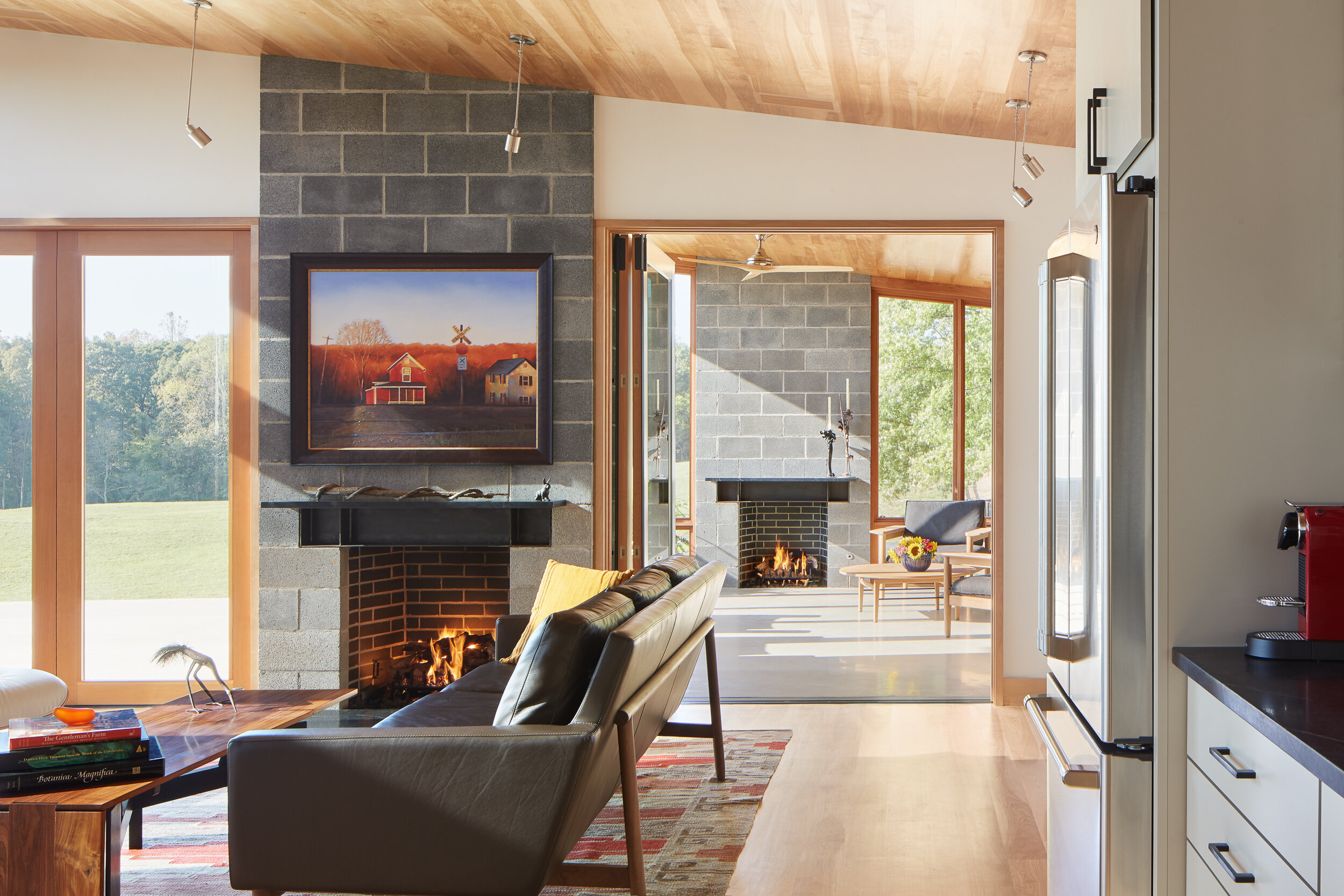
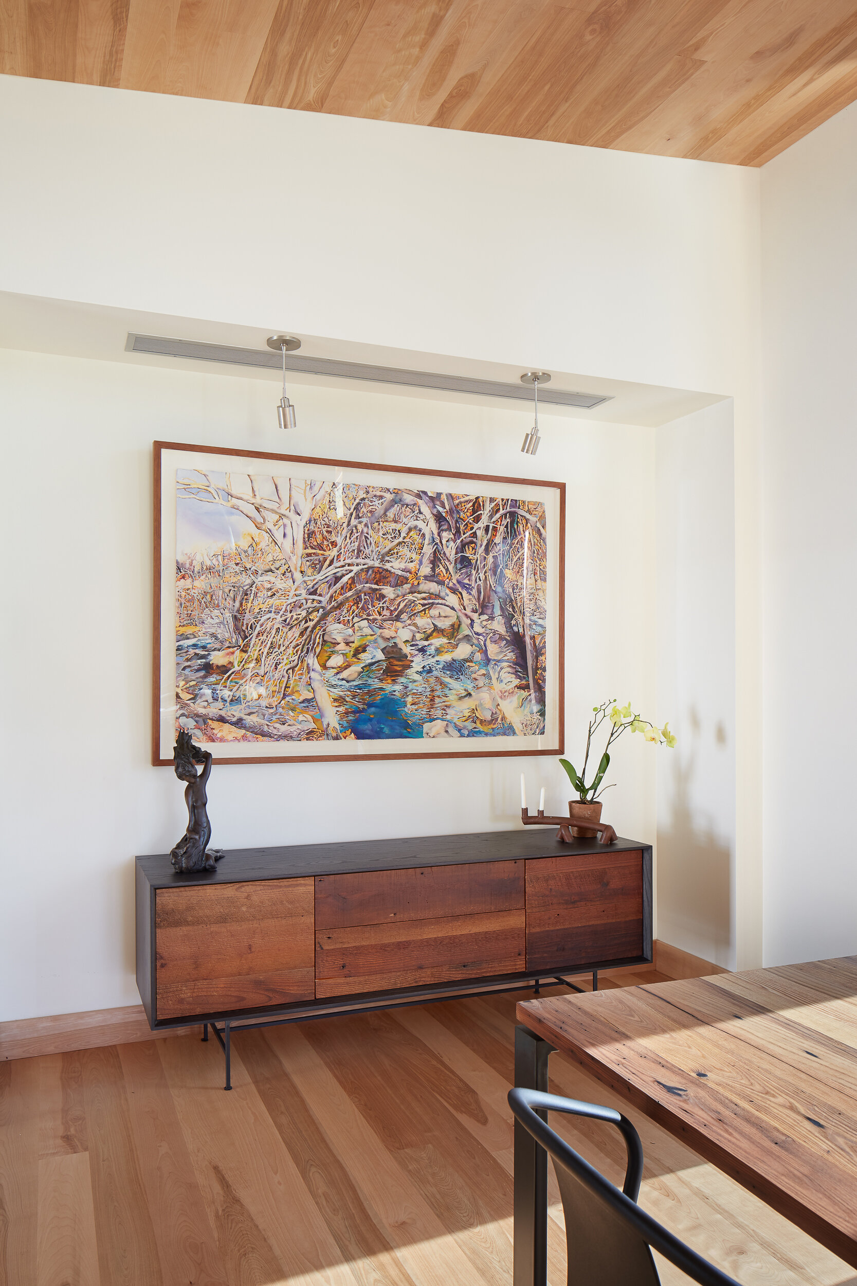
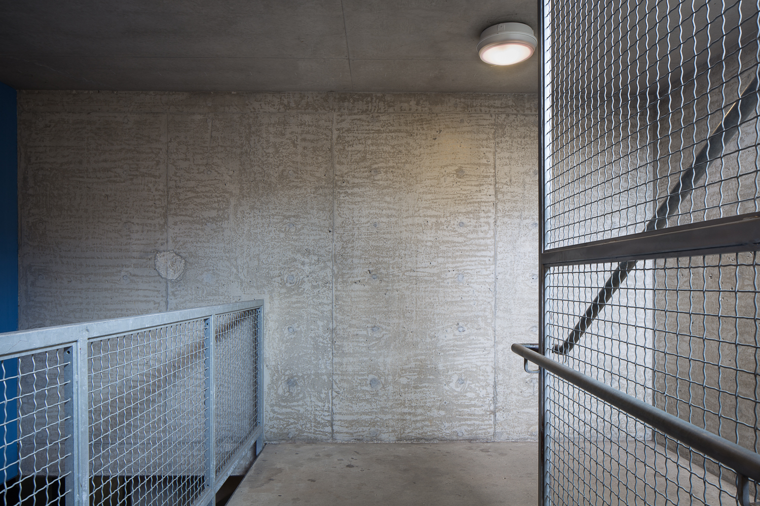
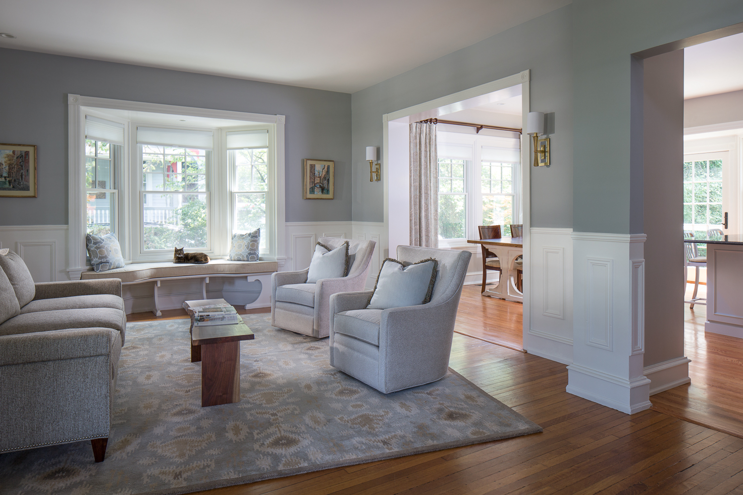
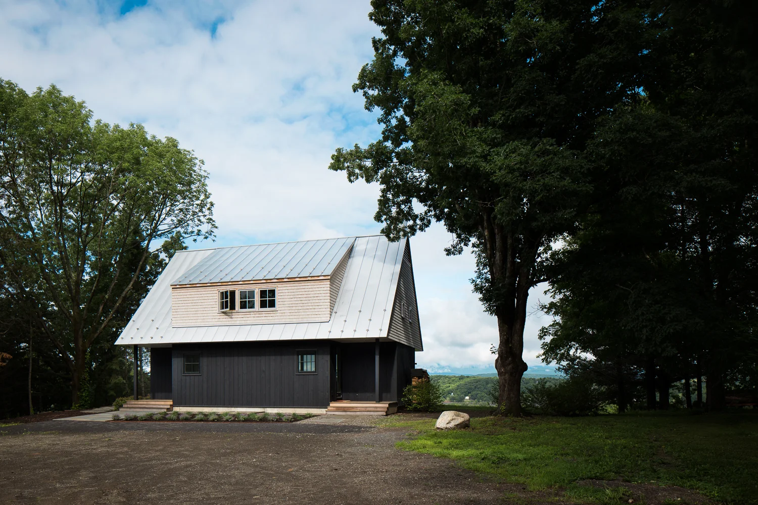
I moved to Philadelphia last February, but was very happy to get back to DC and Bethesda to photograph these lovely projects for Structure Custom Homes. View selected images from the shoot below.
Capitol Hill East Row Home Expansion // Studio Upwall Architects
I recently photographed a lovely row home expansion project in the Capitol Hill East neighborhood of DC, designed by Studio Upwall Architects and built by Impact Construction. We had the shoot on a beautiful fall day, and were able to capture the amazing natural light in the home, maximized by Studio Upwall’s design.
The rear facade of the house — with it’s floor-to-ceiling windows and sliding door to allow access to the rear deck — allows the home to fill with this striking golden light in the morning, and gives the bedroom a unique indoor-outdoor feel.
The kitchen benefits from the project’s most unique feature — a two-story, open-air light well that allows natural light and a breeze to penetrate the side of the home, a rarity in a row home like this.
From the backyard area, the exterior details reveal themselves: the simple, but striking material palate, the partially covered seating area on the interior of the light well, and the expansive rear deck area that blends seamlessly into the kitchen. And how could I miss that amazing reflection of the sky in the second-story glass railing?
The homeowners’ two energetic cats seemed to love exploring the custom-built shelves, seen above.
As always, we wrapped up the day with the trademark twilight exterior photograph, with the camera positioned on top of a Jeep in the driveway. All of the home’s features are on display, and I think this shot does a great job at showcasing the balance between the inside and outside spaces of the design.
Spa Creek House -- Annapolis, Maryland // GriD Architects
I recently had the chance to photograph a beautiful waterfront home, for GriD Architects.
The home, located on a basin of the Chesapeake Bay in the heart of Annapolis, MD, was the recipient of the 2019 AIA Maryland Merit Award, and the 2018 AIA Baltimore Design Award. And it was a joy to photograph, I must say.
The centerpiece of the home is this striking steel and wood floating staircase.
The quality of light in the house throughout the day was stunning (though unfortunately we got intense cloud cover right when golden late afternoon light would be streaming into the living room), which made it a snap to get some detail shots of the stairs, the green roof and the master bathroom.
We wrapped up the evening capturing the view from living room, with an amazing breeze flowing into the house.
Warrenton, Virginia Farmhouse // Trout Design Studio
For me, the most rewarding part of this job is opportunity to transform exceptionally thoughtful residential architecture into a two-dimensional medium, while maintaining the feeling and mood conveyed by exploring the architecture in person. I’ve been lucky to work with Trout Design Studio on a few projects, a firm whose work exemplifies the interesting moments and meticulous attention to detail that make me love photographing architecture.
This project, a beautiful farmhouse, showcased an elegant modern design, based on a cinderblock framing structure in keeping with the vernacular architecture of the region.
I find photographing architecture similar to watching movies on repeated viewings, or closely examining pieces of fine woodworking (which happen to be two of my hobbies; I recently watched The Big Short two times in close succession and was able to pick up on many brilliant details I missed at first). I love searching for all of the little details and hidden themes that the director chose to put in the film, and looking closely at the joinery that allows a piece of handcrafted furniture to flawlessly come together. In architecture, like in movies and woodworking, the smallest details are often intentional, and I try to work with the architect to capture the spirit of the project as best as possible.
Through the process of staging, composing, and modifying light, I try to capture the mood and detail of the project, so viewing the photograph can be a nuanced, interesting experience, just like experiencing the architecture in person.
We wrapped up the first day of the shoot with a twilight interior of the living room area, which frames a beautiful view of the rolling hills and pond outside. There were a few horses roaming around the fields, but sadly none ended up in the right place at the right time to be featured in the photograph.
As the sun rises, the front elevation of the house gets illuminated with beautiful golden light, so we took the opportunity to capture some exteriors, and got lucky to have brilliant morning clouds in the background. These were taken with the tripod in the rear bed, or on the roof of a robust Kubota four-wheeler that was expertly piloted through the hills by the architect.
We wrapped up the shoot with a tighter shot of the living room and porch areas, and some detail interior shots. Shooting this project was a blast, and I’m very happy that I had the chance to photograph such a beautiful home.
Dupont Circle Row Home // Trout Design Studio
Last summer I had the chance to photograph some exteriors of this stunning, historic row home in Dupont Circle for Trout Design Studio. The paint was stripped from the exterior bricks, and the entire four-story home was redesigned and renovated from the ground up, with painstaking attention to detail. As just one of many examples, the architect, Michael Lee Beidler, showed me how the tile patterns in the bathrooms were laid out such that the pattern was entirely continuous, with no partially cut tiles around the border.
The level of craftsmanship and attention put into the exterior faces and areas of the home was equally impressive.
My personal highlight from this shoot was photographing this gorgeous rooftop lounge –– obscured from street view per the neighborhood’s rules –– in a few different lighting conditions. My favorites were naturally taken at golden hour (below) and twilight (header).
Design of this caliber is a joy to photograph, and the project received some well-deserved attention in the spring issue of Home & Design Magazine!
Anne d’Harnoncourt Sculpture Garden & Parking Facility at the Philadelphia Museum of Art // Atkin Olshin Schade Architects
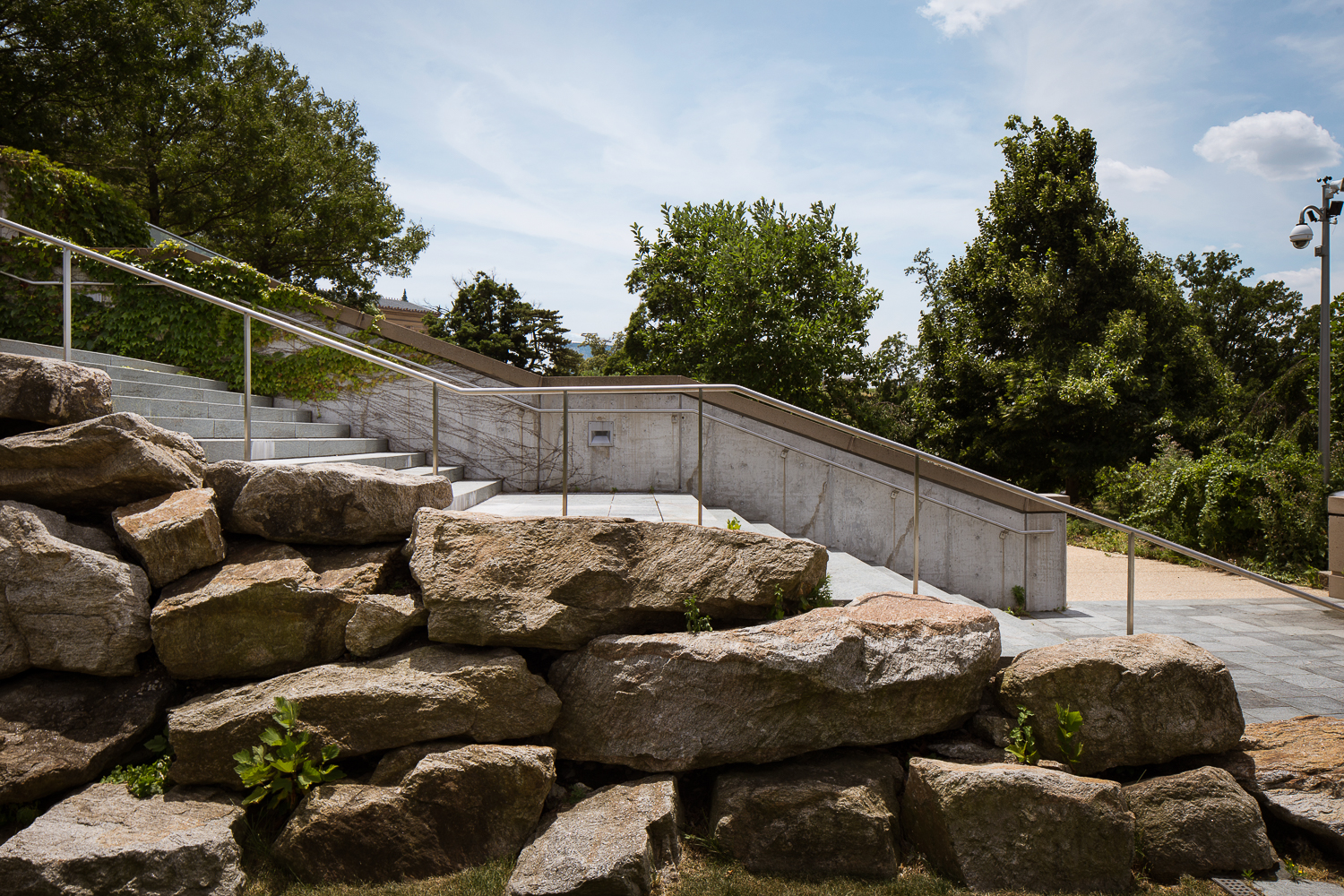
The Philadelphia Museum of Art has long been plagued by a lack of parking sufficient to accommodate the great amount of traffic that it draws. AOS Architects designed this project as an elegant solution to this problem –– a 442-spot underground parking lot, whose one acre roof doubles as a sculpture garden, and urban greenspace.
The elegant glass pavilion that marks the pedestrian entry to the garage frames a beautiful view of the iconic architecture of the museum, creating the striking one-point perspective photo shown above.
This project incorporates many sustainable design elements, and was officially commended by the EPA. The green roof and use of airways allow the garage to avoid the use of mechanical ventilation, and many of the boulders excavated from the site were incorporated back into the landscape.
New Residence at the Swiss Embassy // Steven Holl Architects
This project was something of a dream come true for me. Everybody knows that Mies designed the MLK library, and that if you walk blindfolded on the National Mall you're likely to run into a building designed by I.M. Pei, or Gordon Bunshaft, or David Adjaye. I, however, had no idea that DC has its very own architectural marvel designed by the legendary Steven Holl.
In 2001, an international design competition was launched to replace the old Swiss Residence, which was in poor condition. Out of ten entries, a jury of blind judges selected the American firm Steven Holl Architects to design the project. This design, made to mimic the rugged, snow-covered Swiss Alps, follows the Swiss Minergie energy-efficiency standards, which are far more strict than what is required in the United States.
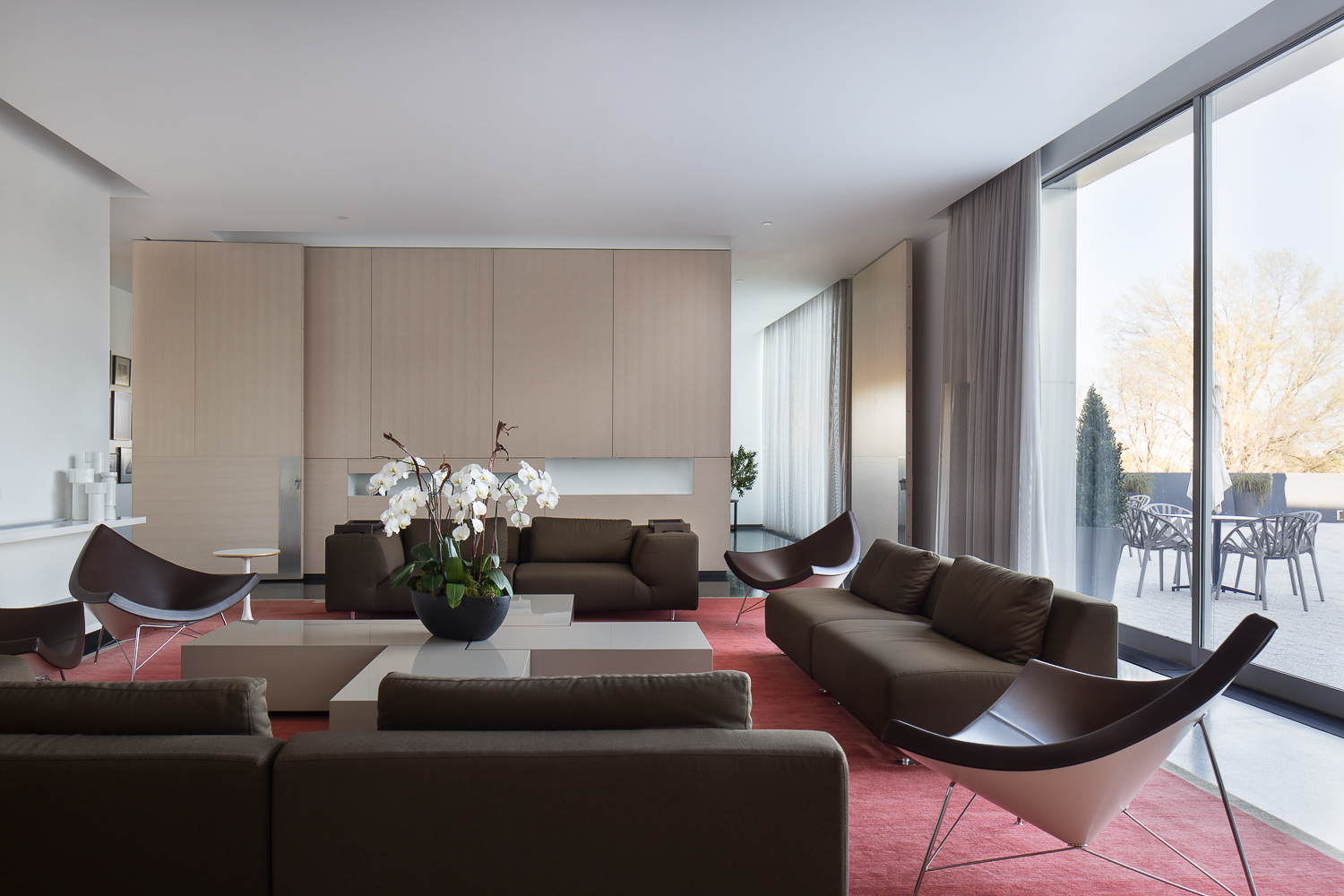
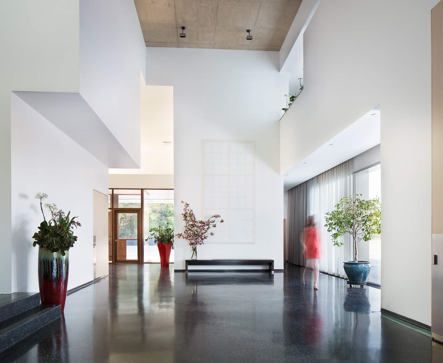
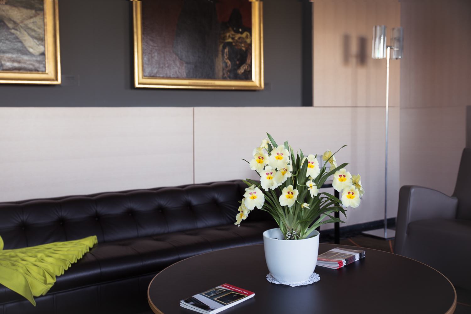
I was given access to photograph the downstairs public space, which hosts over 3,000 guests every year for official events. Though Steven Holl is American, design is a matter of national pride in Switzerland, and for the interior design, Holl teamed up with Zed, a Swiss firm, creating a space whose interior design reflects the overall architecture. Zed exclusively used furniture designed by American and Swiss designers for this project. I was under a bit of a time crunch to shoot these interior photos, and as rushing is the natural enemy of architectural photography, I had to spend some extra time retouching these photos to cover up some omissions I made on-site, but everything came together in Photoshop.
Of course, I'd be remiss if I didn't shoot a twilight photo of this brilliant architecture. This house has been photographed to death, so I didn't want to shoot the same photo that has already been taken a million times. After some trial and error, I settled on this composition with my 24mm Tilt-Shift lens, which I pretty much could not live without. The ambassador got home right in the middle of when we were taking this photo, and luckily, he could not have been nicer, and was very understanding and interested in the process. Needless to say, I am absolutely thrilled with this photo –– it might just be my favorite twilight photo yet!
The Parc Rittenhouse // Cottage Industries, Inc.
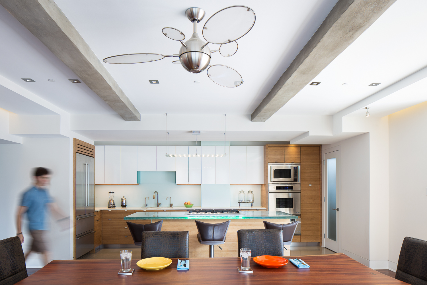
I had the chance to shoot this absolutely amazing condo overlooking Rittenhouse Square, for Cottage Industries, Inc. This shoot was a blast, particularly because the homeowner's adorable dog was trying his hardest to drive us crazy. My assistant was nice enough to stand in as a blurry model in the shot above, which always adds a nice touch of personality and scale to architectural photos.
We wrapped up day one of the shoot with a twilight-interior of this stunning dining room. This view overlooking Rittenhouse Square is very valuable, and my client wanted to show it off in dramatic fashion. I think we accomplished that with this shot.
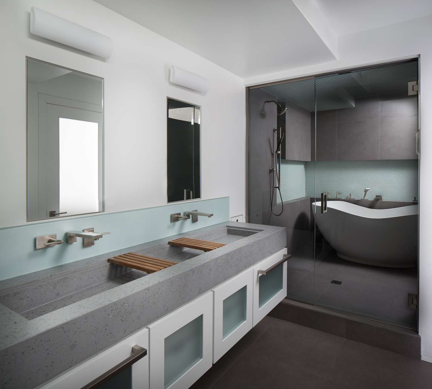
The client put a lot of work into designing and building this bathroom, so I captured it using a "stitch-shift" panorama and some fun lighting tricks. More of the final images are posted below. I was super happy with how this project turned out –– several of these photos went immediately into my portfolio!


The Anatomy of a Twilight-Exterior Image
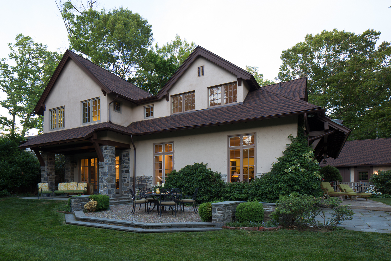
Ah, the twilight-exterior image –– by all accounts, the most striking photo in all of architectural photography. Below I am going to dissect a twilight photo that I made, commissioned by the architect who designed an addition for this house.
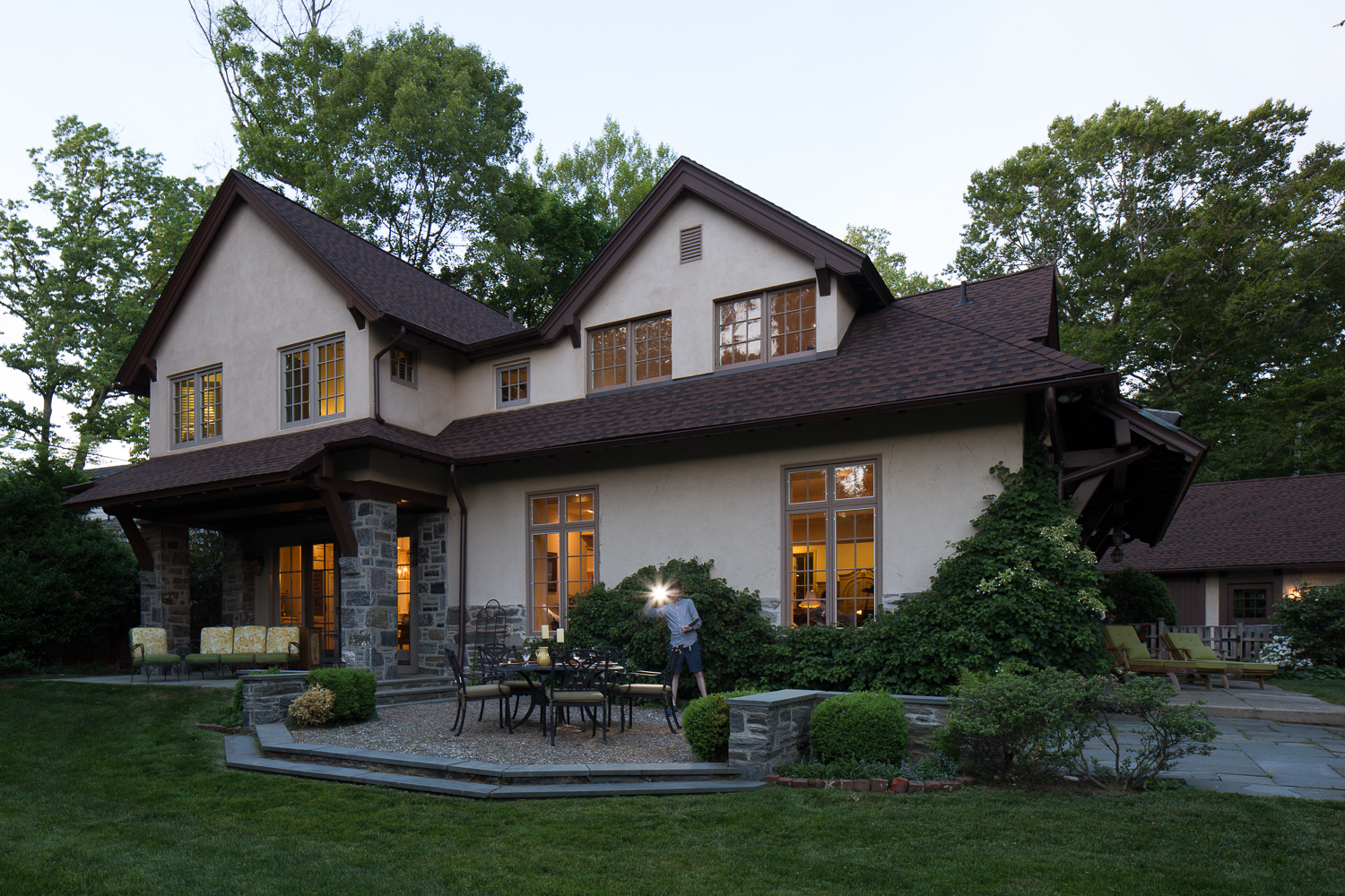
When I was first getting started in architectural photography, I felt the need to go absolutely crazy with light painting and compositing on these twilight photos. I have since learned that the power of this genre of photography lies in its subtleties, but this architecture called for a style of production a bit heavier than I typically use, so it's a good example of the work that goes into each one of these images. Above is the "base" expose that I took, around 15 minutes before sunset. Next, after waiting for what always seems like an eternity, we reached the magical 5-10 minute window, during which the lighting conditions are prime for adding supplemental flash.
One great aspect of this job is the hundreds and hundreds of photos that I have collected of myself, frantically running around a scene, holding a giant flash in the air. After I lit the house and furniture, we played the waiting game again until the sun had completely set. At this point, I captured exposures that I would later composite into the windows, and lit the landscaping with a constant light.
After all of this on-location work, I returned to Photoshop, added a dramatic sky and composited everything together. Yep, quite a bit of work, but I've attached the final result below. Every time I export one of these photos from Photoshop, I breath a huge sigh of relief. I was super happy with how this turned out and so was my client!
Philadelphia Young Playwrights // Irwin & Leighton
I was given the assignment to shoot this super cool commercial space designed by Jessica Rubin Interiors and built by Irwin & Leighton.
This space, right on Vine Street in Philadelphia, serves the Philadelphia Young Playwrights and the Philadelphia Asian Arts Initiative. First up, we shot this studio belonging to the Asian Arts Initiative. Though it looks simple, this space required a substantial bit of subtractive lighting and a good deal of light painting to get the studio into "photograph-able" shape.
Photographing the office space upstairs presented several compositional, lighting and staging challenges, but luckily, with the help of my client's interior-designer eye, we got the space in good shape to shoot.


Cottage Industries, Inc // Wayne, PA
Here are some excepted selections from a project I shot for Cottage Industries, Inc.
This was a whole-house renovation, and we started off downstairs. The sun was not working in our favor this afternoon, so I pulled out one of my favorite time-tested architectural photography tricks to inject some life into the room (using a combination of strobe and photoshop, that is). The homeowner's cat did NOT want to cooperate with us, but we finally got her to stay still for a brief moment, and I composited her into the final image.
The kitchen shot in the gallery below required a similar amount of photoshop magic, but I think it turned out really well. Before twilight hit, I captured a tiny guest-room bathroom using a "stitch-shift," to show a larger frame without suffering the distortion caused by using an ultra-wide angle lens. We wrapped up the shoot with my favorite architectural photography pastime: waiting outside all night to capture the entire range of sunset. These twilight photos are certainly time-consuming, but when the image comes together, the final result always makes the required hours of shooting and retouching worthwhile.


Hudson Cabin // Philip Ivory Architects
Hi! Welcome to the blog! I am going to start off this new endeavor of mine with one of my favorite projects.
Last summer, I traveled up to Hudson, NY to photograph this beautiful cabin for Philip Ivory Architects. We started off the shoot with a twilight-interior image of the living room. This really shows the romantic vibe of this cabin, which is nestled in the Catskills.
Up next, we captured perhaps my favorite interior image of all time. Philip wanted to recreate the style of a shot that he found in Dwell, and I think we really knocked it out of the park.
The natural light in this house was so beautiful that I barely had to use any flash trickery. More of the finals photos from this project are posted below. This house was not yet completely decorated, so I tried my hand at some art direction. Let's see if you can figure out my addition (hint: it's on the wall in the upstairs bedroom shot).


